Dreamweaver MX
Week 4 - October 10th 2006
Assignment #1
Assignment #1 - Due week 5
Tables
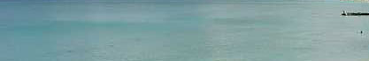
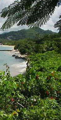
This is a sliced up image for making an image layout with tables.
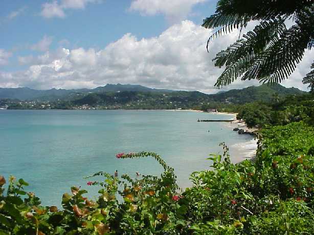


View the Completed Table Layout
Sliced Images and Tables
One question I heard after this lecture is why is the image sliced up? Well it's true you can place the entire image in the background of the table, but in this example we would then not have an alt tag for the heading image to say "Grenada" which wouldn't be good for the blind to access your pages, and we wanted to use a fancy text that most people don't have installed on their computer. And you might be thinking that you could use one big image for the background and use a transparent gif for the text, again this is true, but in this example the text had a semi-transparent shadow and this would not work with a gif.
The other reason I did the lecture in this way is because when we get to the image rollovers for a menu system, those images will have to be added using <img> tags. In some cases you may what your images to incorporate into the background image, that is why I taught the slicing procedure. It's easy to do one big image, but you'll need to know how to assemble parts that make up a whole.
Another thing to keep in mind that if you use a program like Macromedia Fireworks or Adobe ImageReady to make an image layout, it will automatically slice your image and make a table to hold it together. This way you have an understanding of what those programs do.
Also remember that the W3C states that tables should be used solely for tabular data and not for layouts, but the majority of the world still uses tables for layouts and it's up to you as a designer's choice for making your websites.
Making Table Layouts the Old Way
Doing table layouts in the past used "attributes" to set the styling on the table borders in order to make a seamless layout with a sliced image. When you make a table, a dialogue box will appear that will allow you to enter information about the table you want.
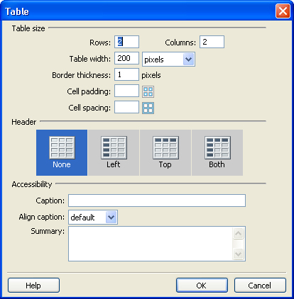
Rows and Columns work just like any other program that uses tables. For the web, you can specify a width for your table in pixels, or in percentages. For an image layout you want to stick to pixels because that is how your images are measured. Percent is good when you want to use all available space on the user's browser (remember not everyone uses the same resolution as you) to display information.
- Border Thickness - this is how thick you want the border lines to be (the actual border makes use of cell spacing)
- Cell Padding - this is the amount of pixels on the inside of the cells (the amount of space between the walls of the cell and the content)
- Cell Spacing - the amount of pixels between cells (you have the border thickness which is the line, this is the space between those lines)
- Cell Padding and Cell Spacing both have diagrams beside them highlighting the effect in blue.
For table layouts you want to be sure to set the border, cell padding, and cell spacing all to 0. This will make sure your image slices will line up together properly. This will of course make your text touch the edges of the cells so be sure to make sure your text is styled so that it doesn't hit the edges.
The headers section asks if your table is to have headers. You can select none, along the top row, down the first column, or on the first row and first column. For image layouts you don't need headers, these are used for displaying data.
Caption will add text to describe your table. The positions are as follows:
- Default - Above the table, centred
- Top - Above the table, centred
- Bottom - Below the table, centred
- Left - Above the table, aligned to the left
- Right - Above the table, aligned to the right
Summary is a place where you can write a summary of what information your table holds. This is used mainly for accessibility purposes, and is not visible on your page.
Remember, that most of this code is deprecated. It still functions just fine, but attributes are losing favour with the W3C.
Table Layouts with CSS
In this section I'm going to go through the lines of CSS code. The code isn't that hard to read and references the options in the CSS dialogue box that we have been using throughout this class. The first thing we did was make our table, just like mentioned above, except we deleted all the width, border, cellpadding and cellspacing information. Next we merged our cells to match how the image was sliced up, leaving us with five cells to work with. Three of those cells contained <img> tags so we didn't worry about adding a class or id to these cells (Remember also that you should include an alt attribute. In the case of the header it was alt="Grenada" to take the place of the heading text in the image, for the other two since they were just a part of the layout we add alt=""). We did however add an id to the table, calling it "tablelayout", as well as adding an id of "menu" and "textarea" to the remaining cells so that we can add background images. The first section of code is:
#layouttable
{
width: 614px;
margin: 0px;
padding: 0px;
border-collapse: collapse;
}
Remember that the # indicates that this CSS style references an id. The width locks the width of the table to the same width as the original image. We're made sure to make the margins = 0, this is the equivalent of cell spacing (because margins are what is around the object you're styling). Padding is the equivalent to cell padding, so again we have set this to 0. The last line is a special piece of CSS that cannot be accessed through Dreamweaver's CSS Dialogue box. Border-collapse is a property that determines whether the row and cell borders of a table are joined in a single border or detached as in standard HTML. You can also state border-collapse: separate.
The Next section of code we're going to look at is:
#layouttable td
{
margin: 0px;
padding: 0px;
}
In this piece of code we are referencing all the td element tags within the table with an id of layouttable. This is in case we have other tables in the page that we don't want to be affected by this code. This is once again simple, we just want to ensure that there is not padding or margins on all the cells in the table.
The next piece of code refers to the id textarea:
#textarea
{
background-image: url(images/textarea.jpg);
background-repeat: no-repeat;
height: 69px;
width: 417px;
}
Background-image is the code CSS uses to place an image in the background of tag. While you don't necessarily need to understand how to write the code you should be able to read it to verify that Dreamweaver wrote it correctly. Dreamweaver MX 2004 is notorious for have bad CSS handling and will mess up your code sometimes. The Background-repeat line specifies that the image should only be shown once, when putting together a layout you definitely don't want to have the image repeat. The width and height specifications ensure that the cell will show the entire image. Without these the cell will only extent downwards for as far as the text goes and then stop. This is why you have to ensure the you enter the size of the image, so that your layout will show properly.
The last piece of CSS code we wrote on this page was:
#menu
{
background-image: url(images/menu.jpg);
background-repeat: no-repeat;
color: #FF0000;
height: 386px;
width: 197px;
text-align: left;
vertical-align: top;
}
Like the code above we specified a background image with no repeat and set a width and height. The color: #FF0000 line indicates the colour of the text (CSS uses american spelling). The vertical-align makes the text go to the top of the cell, and the text-align is used because CSS vertical align sometimes goes funny and will change the horizontal alignment along with the vertical. This just ensures that the text stays where we want it to.
When you look at the page, you'll still see that the menu list isn't all the way to the left of the cell. This is because list items have a default padding and margin to them. You can refer to week 2's lesson for styling the list items. Also I am aware that the menu text is very hard to read in this layout, obviously when doing a real site you'll make design choices that result in an easy to read format.
For more information on making tables in Dreamweaver (this won't cover CSS), look at chapter 12 in the textbook (pg. 427 with the Dreamweaver MX 2004 text). This will also show the layout view method of making table layouts and drawing in your cells as you would in a program like Quark or Fireworks. But again, I wanted to show you how to assemble pre-made images, and be aware of the code that goes into it.